Articles · Hints & Tips
Website Trends That Need to Disappear
Some web design trends look flashy but hurt speed, usability, trust, and enquiries. Here are the website trends local businesses should leave behind.
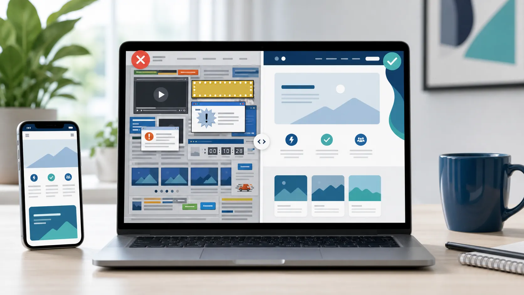
The internet changes fast.
One minute everybody is adding bevel effects and glossy buttons. The next minute every website looks like a minimalist Scandinavian kitchen with anxiety.
Web design trends come and go constantly, and to be fair, some genuinely improve user experience.
Others?
Well...
Some trends deserve to be quietly escorted into the sea and never spoken about again.
So in the spirit of public service, here are some website trends we think need to disappear, preferably immediately, especially for local business websites in Blackpool and across the Fylde Coast.
Some of these are annoying. Some are outdated. Some actively hurt conversions.
And some should probably be investigated by the authorities.
Let us begin.
1. Autoplay Videos
Nothing says:
"Welcome to our website"
...quite like your speakers suddenly exploding into life while you are sat in a quiet room.
Autoplay videos are one of the quickest ways to:
- annoy visitors
- slow down your website
- damage mobile performance
- increase bounce rates
Especially when the video covers the whole screen, has dramatic drone footage, includes emotional piano music, and somehow still tells you absolutely nothing about the business.
They Also Destroy Performance
Large autoplay videos are terrible for load times, mobile data usage, Core Web Vitals, and SEO performance.
Meanwhile the visitor just wanted a phone number and opening hours.
The Worst Version?
Videos that autoplay and follow you down the page.
Why?
Who asked for this?
"You know what people would love? A moving rectangle chasing them while they try to read."
If your website needs video, use it carefully. Let people press play themselves, keep the file lean, and make sure it supports the page rather than hijacking it.
2. Giant Sliders Nobody Clicks
Ah yes. The homepage slider.
The digital equivalent of a business shouting six things at you simultaneously.
Most sliders rotate too quickly, contain too much text, perform terribly on mobile, and are barely clicked by anyone.
Yet somehow they continue surviving like the world's slowest evolving species.
Why Sliders Usually Fail
Visitors do not patiently sit watching homepage banners rotate like they are waiting for the next train announcement.
Most users skim quickly, scroll immediately, and ignore carousel content entirely.
Meanwhile sliders slow websites down, push important content lower, and create visual clutter.
And often contain enough animations to make your laptop sound like it is preparing for take-off.
3. Popup Overload
We get it. You want more enquiries. More signups. More leads.
But some websites behave like they have consumed three cans of energy drink and lost all self-control.
You land on the homepage and immediately get:
- newsletter popup
- cookie popup
- chat popup
- discount popup
- "WAIT BEFORE YOU LEAVE" popup
At this point the actual website is hidden somewhere beneath several layers of desperation.
Popups Are Not Always Bad
Used carefully, they can work. But timing matters.
Maybe let people actually read the page, understand what you do, and remain conscious before launching five interruptions directly into their eyeballs.
4. Tiny Grey Text on White Backgrounds
Minimalism is fine. Unreadability is not.
Some modern websites seem terrified of contrast.
You end up with pale grey text, ultra-thin fonts, and microscopic sizing, all elegantly displayed against a slightly different shade of pale grey.
Very stylish. Very modern. Absolutely impossible to read.
Especially for mobile users, older visitors, and anyone possessing actual human eyes.
5. Stock Photos of Fake Meetings
You know the ones.
A group of suspiciously attractive people laughing at a laptop, pointing at invisible graphs, wearing immaculate shirts, and apparently having the best meeting in recorded human history.
Meanwhile nobody in the photo remotely resembles a local plumber, a builder, a Blackpool cafe owner, or literally anybody you would meet in real life.
Real Photos Build More Trust
People connect with authenticity.
Real photos of your business, your team, your work, and your premises almost always outperform generic stock images.
Especially for local businesses.
Because customers want to know you are real.
Not a fictional accounting firm based inside a stock photography dimension.
6. Websites That Take 8 Seconds to Load
This is not even really a "trend."
It is just somehow still happening.
In 2026 there are still business websites loading enormous scripts, giant background videos, fifteen plugins, seven font libraries, and animated counters nobody needed.
All to display a logo, a phone number, and three paragraphs of text.
Meanwhile the visitor has already left and made a brew before your homepage appears.
Fast Websites Win
Speed matters massively for SEO, user experience, mobile users, and conversion rates.
People notice fast websites immediately. Even subconsciously.
A fast website feels modern, trustworthy, and professional.
A slow website feels broken.
This is why our fast UK web hosting and lightweight build approach are such a big part of how we design websites for local businesses.
7. Chat Widgets That Attack Instantly
You open a website...
...and within half a second:
"HEY, HOW CAN WE HELP?"
Please. Give us a moment.
We have not even seen the homepage yet.
Some chat widgets are genuinely useful.
But others behave like an overexcited shop assistant sprinting towards you before you have even entered the aisle.
Good Live Chat Feels Helpful
Bad live chat feels intrusive, distracting, and aggressive.
Timing and restraint matter.
Sometimes less really is more.
8. Endless Walls of Text
This is slightly awkward to mention during a long blog post.
But hear us out.
Huge unbroken blocks of text are painful online.
People scan websites differently than they read books.
Good web content should use headings, spacing, bullet points, and shorter paragraphs.
Otherwise visitors arrive at your homepage and feel like they have accidentally opened a Victorian novel.
9. "Creative" Navigation Menus
There is a dangerous point where creativity starts actively harming usability.
Some websites now hide navigation behind mystery icons, fullscreen transitions, animations, hover effects, and menus that require solving a puzzle.
Meanwhile visitors are simply trying to find services, pricing, and contact information.
Navigation should be obvious.
You are not designing an escape room.
10. Websites Designed Entirely for Awards
Some websites look incredible.
For about twelve seconds.
Then you actually try using them.
Suddenly text slides sideways, images distort, scrolling becomes weird, buttons vanish, and your CPU starts sweating visibly.
Certain ultra-experimental websites seem designed primarily to impress other designers rather than actual customers.
Which is fine for design showcases.
Less ideal for local businesses, service companies, restaurants, and tradespeople.
Because normal users generally prefer websites that function properly.
Strange, we know.
11. Everything Being Hidden in Tabs and Accordions
Accordions can be useful. Tabs can be useful.
But some websites now hide absolutely everything behind clicks.
You visit a service page and immediately have to expand sections, reveal content, click hidden menus, and open panels just to learn basic information.
At some point your website starts feeling less like a business website and more like a treasure hunt.
12. Overcomplicated Homepages
Some homepages try to include every service, every testimonial, every award, every social feed, every blog post, every animation, and every colour known to science.
All simultaneously.
The result?
Chaos.
A homepage should guide visitors clearly.
Not emotionally overwhelm them before they have reached the second scroll.
What Actually Works in Modern Web Design?
Ironically, the best-performing websites are often the simplest.
They focus on speed, clarity, usability, mobile performance, trust, and good content.
Not gimmicks. Not endless effects. Not trying to reinvent the internet every six months.
If you are planning a new site, our responsive web design service is built around those basics: clean layouts, quick loading, mobile-friendly pages, and content that helps people understand what you do.
Why Simplicity Usually Wins
Simple websites tend to load faster, rank better, convert better, work better on mobile, and frustrate people less.
Which turns out to be surprisingly important.
Especially for local businesses where visitors mainly want to understand your services, trust your business, and contact you quickly.
The Good News for Local Businesses
A lot of competitors are still using outdated, cluttered, slow websites.
That creates opportunity.
Because a modern website that is clean, fast, mobile-friendly, and easy to use already puts you ahead of many local competitors across Blackpool and the Fylde Coast.
And if you want to dig deeper into why messy websites lose enquiries, we covered that in 5 reasons your website is losing you customers.
Final Thoughts
Web design trends will always come and go.
Some genuinely improve websites.
Others mainly improve stress levels for web developers.
At the end of the day, the best websites are not necessarily the flashiest.
They are the ones that load quickly, communicate clearly, build trust, and help visitors become customers.
Simple.
And ideally without autoplay saxophone music suddenly blasting through somebody's speakers at 11pm.